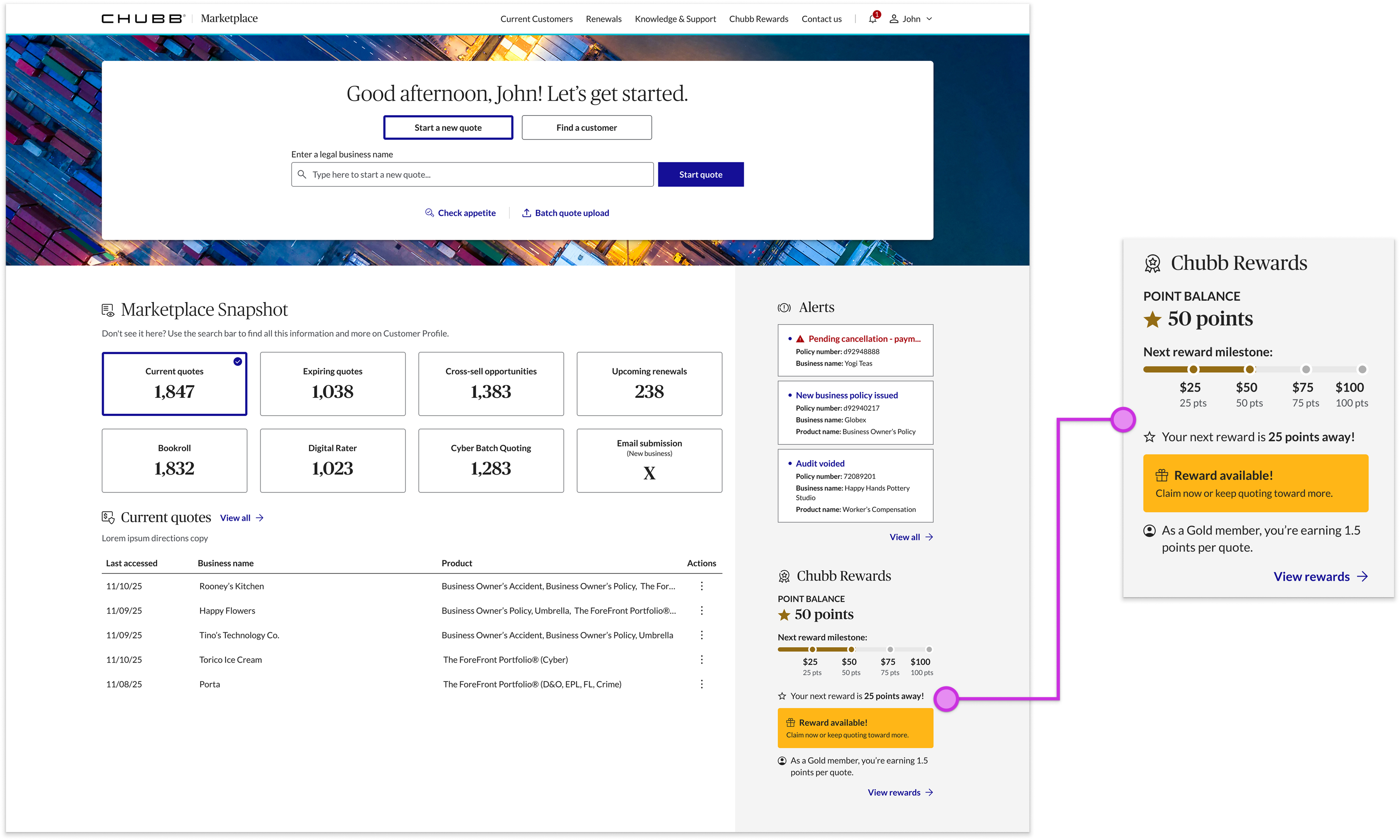
A design was already in motion, created before anyone understood the Rewards program
I led this initiative as Experience Design Manager, with the hands-on design done by one of my direct reports. We handed off the Marketplace dashboard file to the development team with a placeholder rewards section — designed before anyone understood how the program actually worked. The PO just wanted it shipped, but I knew the design wouldn't drive business results. With a three-week deadline before dev needed final designs, my job was to design a solution that would motivate agents to quote more and that intuitively communicated the rewards program structure.
91% of agents hadn’t claimed a reward — and I didn’t need to know exactly why
In 2025, 91% of agents never claimed a reward. There were three possible reasons — but rather than spend time pinning down the exact split, I realized a single design could solve the two that were in scope. So the precise breakdown didn't matter.
Three options, and the data picked the hardest one
I had my designer produce three options: a simple points display, a standard progress bar, and a progress bar showing the actual dollar prize being worked toward. We tested in UserZoom and discovered that agents overwhelmingly preferred the third: the one that showed money, not points. And like many great solutions, it was the one that dev sized as the highest effort.
The PO heard "more effort" and reached for the easy option
Dev flagged that showing and resetting the dollar target was more work, and the PO, who understandably tenses up hearing that, wanted to fall back to the easy placeholder. I refused, took the case to the domain lead, and secured her support. But she and I agreed on something else as well: even the winning option three still wasn't clear enough.
The answer was a component our design system didn't have
Every option so far had been built from existing design-system components — and that was the ceiling. I had my designer build a custom component instead and set parameters: brand-color gradients to distinguish the four reward tiers, AAA accessibility, an indication of milestones already achieved, and a message of rewards ready to claim. We modeled it on the Starbucks tracker.
We didn't just get approval – we contributed to the design system
My designer and I brought the custom component to the Design System team. They agreed it was a genuinely new case, approved it, refined a few styling details, and added it to the library. The domain owner loved it, dev confirmed it was achievable in the timeline, and we shipped our design. The expected outcome is a 20% increase in quoting once it's live in July 2026.
Next time, I gather the pieces before we start
The biggest lesson wasn't in the design — it was in the setup. A placeholder got designed before anyone understood the requirements, and we paid for it by solutioning live during development. Next time, I take the initiative as the design leader to assemble every missing piece before we begin.